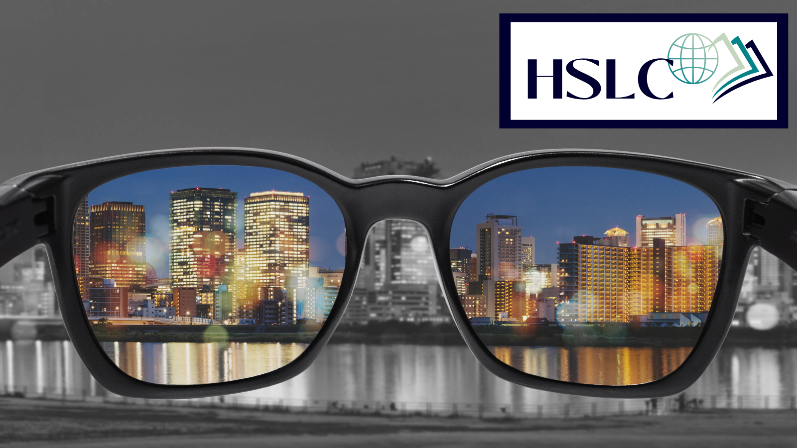
When thinking of accessibility guidelines, most people’s minds go directly to the size of doorways, having ramps verses stairs, restroom accommodations, and all those physical requirements necessary for our patrons with disabilities to use the library. However, one of the simplest ways to make your programs and building accessible has nothing to do with the physical space, but with the marketing materials and signage you create.
According to cdc.gov, approximately 12 million people, 40 years and over, in the United States have vision impairment. Also, according to colourblindawareness.org, 1 in 200 women and 1 in 12 men have some degree of color blindness. Having accessible resources ensures that people with disabilities, like the above and more, can use a product or understand materials. Accessibility is a basic requirement for usability. Usability, then, is a measure of how easy a product or service is for everyone to use, and how well it allows users to accomplish their goals. These two concepts not only work together but are a vital component for effective marketing and outreach.
When making any signage or marketing materials, it is always best to start with your text, or what you want it to say. While using inclusive language is important, for today’s discussion, we are just focusing on the design elements. Font choices are significant! Sticking to the sans-serif fonts, which tend to be more legible than serif fonts, narrow fonts, or decorative fonts, will serve you well. Great font choices include, but are not limited to, Futura, Helvetica, Verdana, Tahoma, Eras, Arial, and Trebuchet. Remember to steer clear of italics, underlining, or condensed fonts as they can appear too busy for people with dyslexia. If you are looking for a way to emphasize text, consider adding a box around that text rather than altering the font or style.
Font sizes should be a minimum of 12pt for reports or documents. When creating signage or marketing materials, you will want your text to be larger though. Also, keep in mind the distance from which you want your materials to be readable. A good trick when creating your materials is to zoom out to mirror the size of those materials from the desired distance and ask yourself if you can read all of the text.
Now, everyone loves a very graphic colorful sign, but if done incorrectly it will be completely ineffective. As you are adding those graphic elements, remember contrast is your friend! The easiest way to achieve contrast is to use light colors against dark ones. This is vital for any patrons that suffer from any degree of color blindness, as well as other visual impairments. Make sure to avoid using the color combinations that cause the most issues for people, such as red/green, purple/blue, and orange/yellow. Also, it is a good idea to avoid 2 hues of the same color, even if one is lighter than the other. For example, light blue text on a dark blue background can cause problems. A good trick for ensuring that your message will get across is to take your materials and view them in greyscale. If everything is easily readable in greyscale, you have achieved the needed contrast.
Another friend you need to get well acquainted with is white space. As you add elements, ask yourself if that element adds to the message or distracts from it. Just like with our fonts, zoom out and if it feels busy, edit down and create white space. While you are zoomed out, also make sure there is space between any graphics and text. If it feels busy to you, for someone with visual impairments it will be largely unreadable.
Lastly, when you are happy with your finished product, give a final thought to where these materials will be viewed. If it will be printed and viewed in an area with windows, you likely won’t want to laminate it or use plastic document holders. Glare can render all of the work you just did useless because no one can see it.
If you follow the above guidelines, you will be on your way to creating materials that are both accessible and useable. Practice your new skill by looking around your library and take stock of any signage or materials that could use an accessibility facelift. Remember clean design aids readability for everyone!
Looking for guidance on maximizing the accessibility of your marketing materials? Or some guidance on library outreach in general? Reach out to see how we can help.

Jenn Malik-Williams, Digital Outreach Specialist


